CINTAS ALL-DAY
Stretch the boundaries of workwear
Branding | Product LaunchBusiness casual gets a promotion.
Cintas' new business casual line erased the divide between looking sharp and feeling comfortable. Beyond just showing uniforms, we needed to shift perceptions about workwear.
An interactive lookbook balanced aspiration with authenticity. Every touchpoint was written like we were talking to people, not purchasing departments.

Cintas All-Day Case Study
-
Employers want their employees to look professional. But not uncomfortable. Cintas understood this tension so they created the All-Day collection. Our challenge wasn't just to showcase clothes - it was to shift perceptions about workwear.
-
Don’t present uniforms like uniforms. Talk about All-Day like the breakthrough it is. Create a visual language that transforms rental workwear into desirable fashion.
-
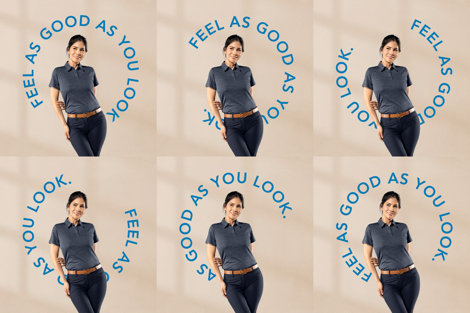
We started with the brand itself. Working within Cintas brand standards, we modified their typeface to create something distinctive yet ownable. We incorporated shapes suggesting a power button and curves that echo the clothing's flexibility. A simplified 'AD' lettermark added a modern, consumer touch. These curved elements became visual anchors throughout - appearing in photography sets, lookbook layouts, and graphic details.
Next we elevated the visual storytelling. Studio shots captured both the refined details and how All-Day looks on real professionals across industries. Every image worked as hard as the clothes themselves.
We wrote like we were talking to people, not purchasing departments. Headlines like "Comfort that never clocks out" and "Made to match your momentum" spoke a simple truth: work is demanding enough without uncomfortable clothes. No industry jargon. No buzzwords. Just honest talk about looking good and feeling better.
The lookbook brought it all together. Clean layouts and considered typography created a premium feel. Each page balanced aspiration with authenticity, giving it the persuasive substance of a business tool. We never lost sight of the fact that these clothes have to work as hard as the people wearing them. So while everything feels fashionable, it's all grounded in a world where coffee spills and deadlines exist.
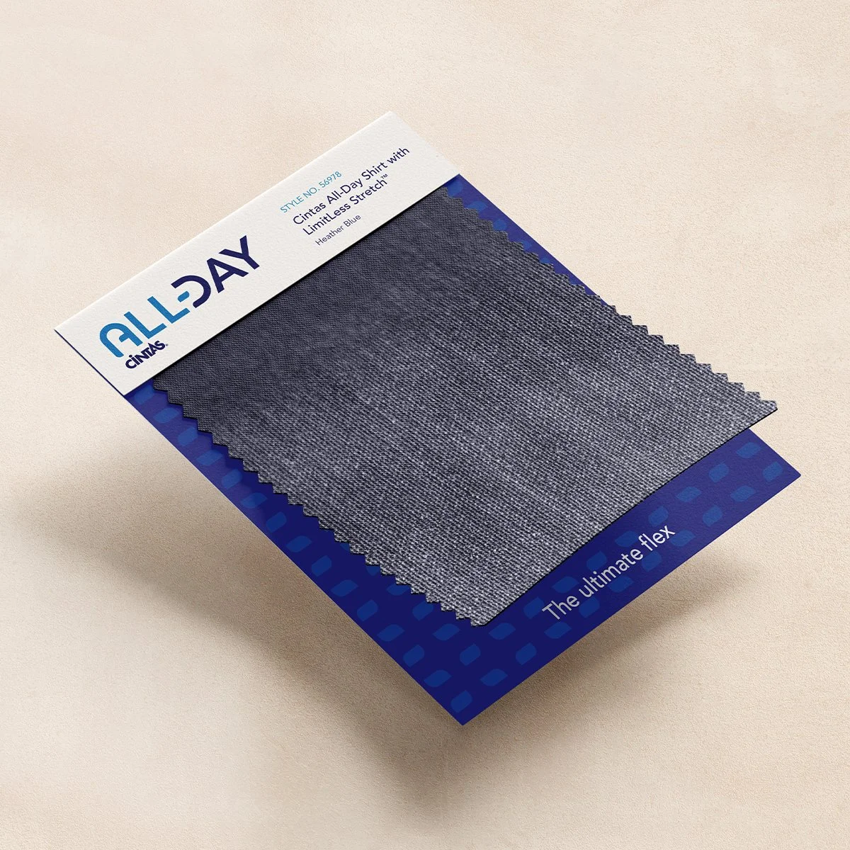
This approach extended across every touchpoint. Product tags became elegant mini-brochures, combining fashion-inspired design with clear information and convenient QR codes. The landing page turned browsing into discovery, while email templates maintained brand aesthetics and drove clear action.
For the sizzle video, we wove product features into a narrative about polish and performance. Dynamic shots moved from fabric details to workplace environments. Modern music and motion added energy while text animations emphasized key messages without overwhelming the visuals.
Throughout every element, we maintained a careful balance: sophisticated but approachable, premium but practical. Proving that when you respect the wearer, you elevate the workwear - and the workday.

Credits
Copywriting: Jackie Hunt
Art Direction/Design: Bethany Bingham
Photography: Joe Harrison
©Creative Department


