
SERVATii
Bavarian born. Cincinnati raised.
Branding Refresh | Integrated CampaignCreating a new batch of Servatii fans.
Iconic bakery Servatii needed to whip up new enthusiasm among younger patrons. We found tradition wasn't the problem - it was the solution. Their never-wavering use of authentic ingredients created new appeal for old-world baking.
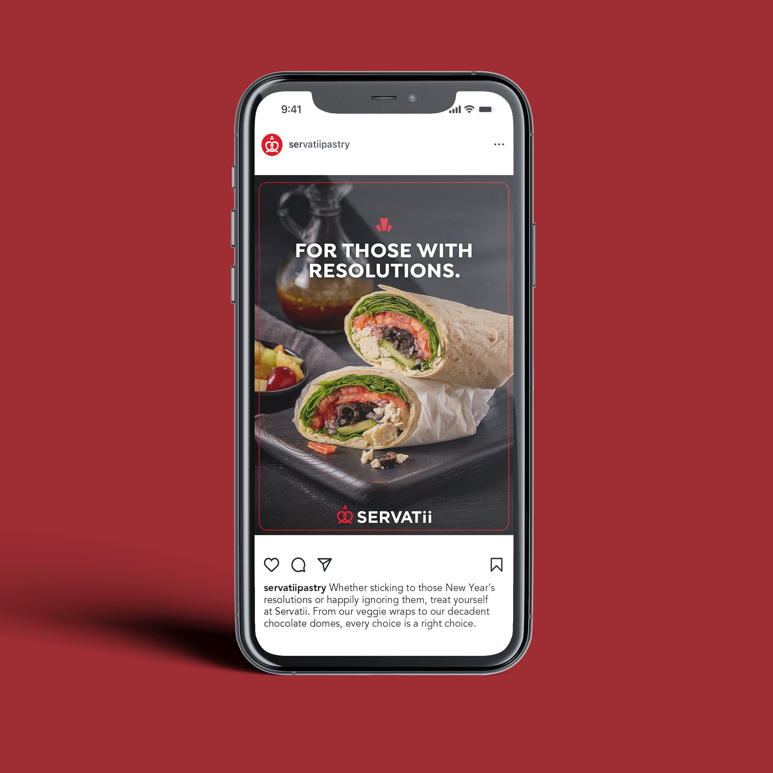
We delivered a full brand refresh: a modernized logo, taglines, social content, outdoor, in-store materials, and website.


Servatii Case Study
-
Whip up new enthusiasm for the iconic Servatii brand while staying true to the bakery’s heritage and loyal following.
-
Spotlight Servatii's steadfast dedication to European-style techniques and authentic ingredients. Romance their craft to rekindle customer cravings and give younger audiences a taste of the extraordinary.
-
For five generations, Servatii has been a go-to family bakery throughout Greater Cincinnati. But while its pastries have stood the test of time, its customer base was aging. Meanwhile, younger consumers were being lured away by the convenience of grocery chains and the novelty of niche bakeries. Servatii needed to rise to the occasion to stay relevant.
Our mission was clear - modernize the Servatii brand to attract a younger clientele without alienating its loyal regulars. No easy feat.
We rolled up our sleeves and immersed ourselves in all things Servatii, savoring every fresh-made pastry, pie and Bavarian pretzel (sure, that meant a few extra trips to the gym, but duty calls).
Here's what we uncovered - shortcuts are forbidden in the Servatii kitchen. When your pastry chefs have trained under Europe's finest, you use pure cream butter even if it costs more. You proof breads for 24 hours because that's what taste and texture demand. And you never, ever compromise on quality.
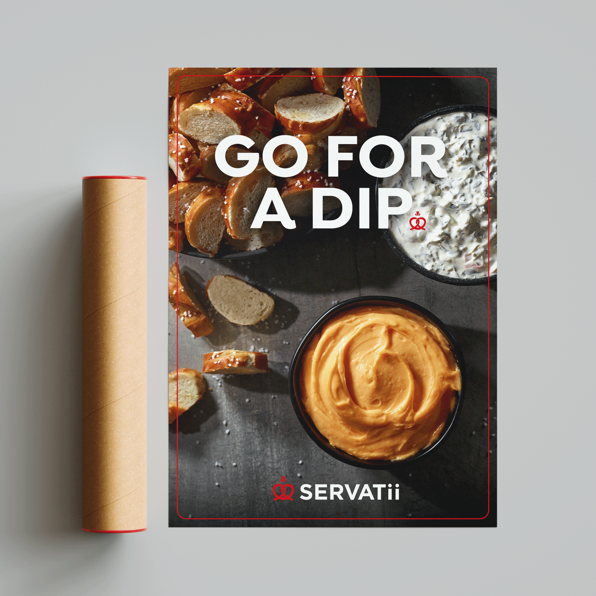
This absolute dedication became our North Star as we set out to refresh the brand. We created a boldly simple logo that embraces their signature pretzel as the heart of their identity, crafting a crown embellishment above it using shapes borrowed from the original design. All while preserving their iconic double "ii" for a perfect marriage of heritage and modernity.
The same attention to detail went into the imagery. Our photography captured every flaky layer and glossy finish in mouth-watering detail, bathed in light that brings out the rich textures only real baking can create.
The result? A revitalized brand that's attracting a new generation of customers while deepening loyalty among longtime fans. A reminder that in a world of shortcuts, the long way around still matters most.

Credits
Copywriting: Jackie Hunt
Art Direction/Design: Bethany Bingham
Photography: RPH Productions
©Creative Department